We built the brand and website for Voutch — a peer-to-peer ticket marketplace for students. The goal was to replace the chaos of group-chat ticket reselling with one neon-bright, spam-free place to list, find, and pay: brand, product, and front-end, end to end.
Challenge
Student ticket resale lives in messy group chats — scams, spam, no trust, no record. Voutch had to feel safer and more legitimate than a chat without feeling corporate or boring to a night-out audience. The identity needed the energy of going out, and the product needed a custom ticket flow built from scratch, not a marketplace template.
Outcome
We delivered the full system: a neon brand built around a confident wordmark and a paper-ticket brandmark, plus a custom-designed and -built ticketing site — 25+ flow screens from listing through cart, checkout, and confirmation. Live at voutch.org.
01
Identity
Not a group chat — a marketplace
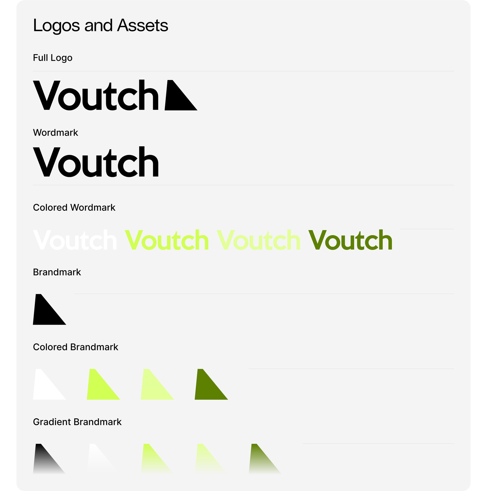
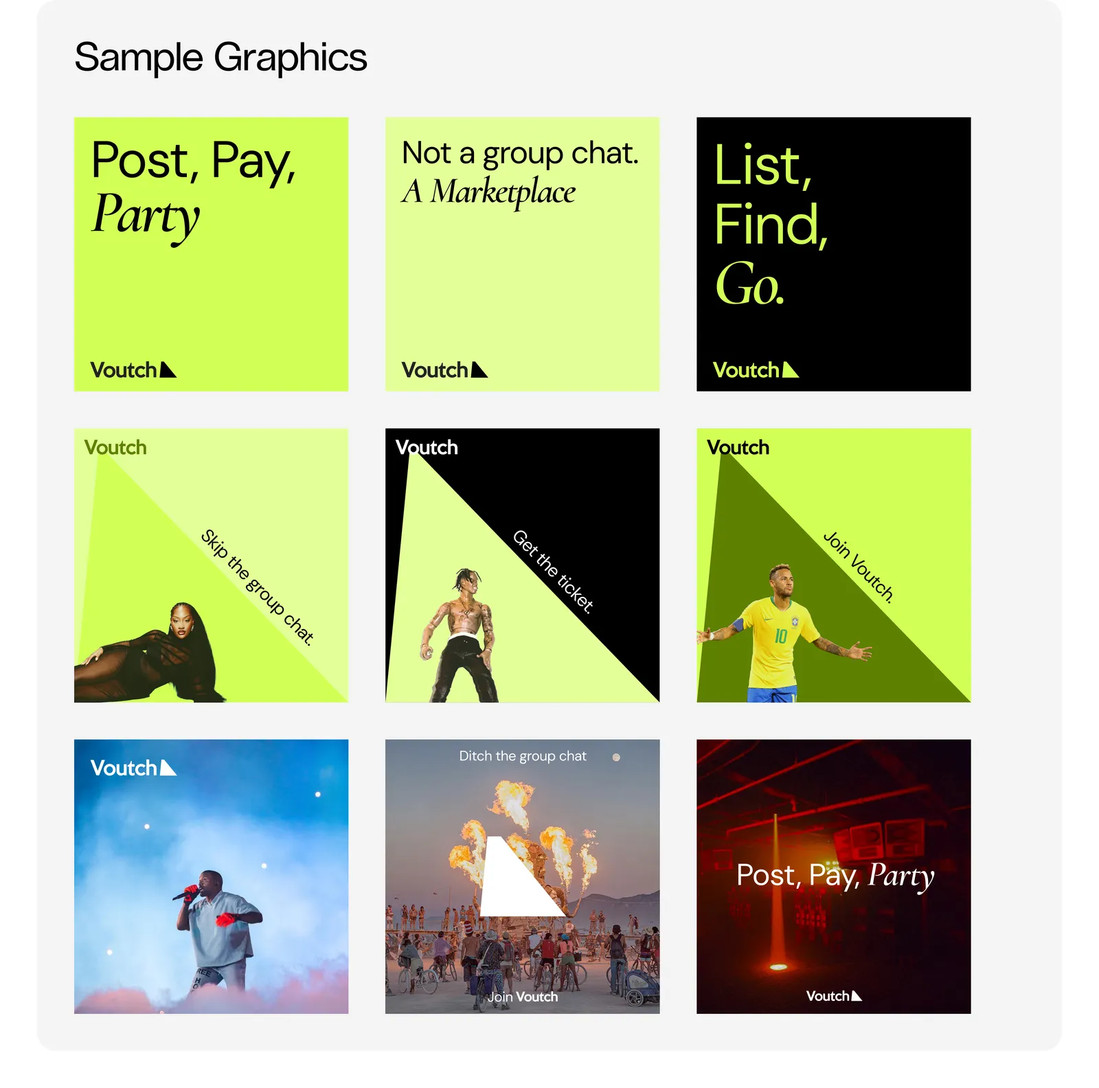
The brand system leans into the energy of a night out: neon accents, a single assertive wordmark, and a triangular brandmark shaped like a paper ticket folded at the corner. It reads as confident and a little loud — a place built to be used at 11pm, not a compliance form.
The system
A confident, assertive wordmark
A triangular brandmark — a paper ticket folded at the corner
A neon-green flood with night-out energy
Keep Calm · DM Sans · Cormorant
Voutch logo + brandmarkVoutch brand graphics
Voutch app icons
02
Website
A custom ticket flow, built
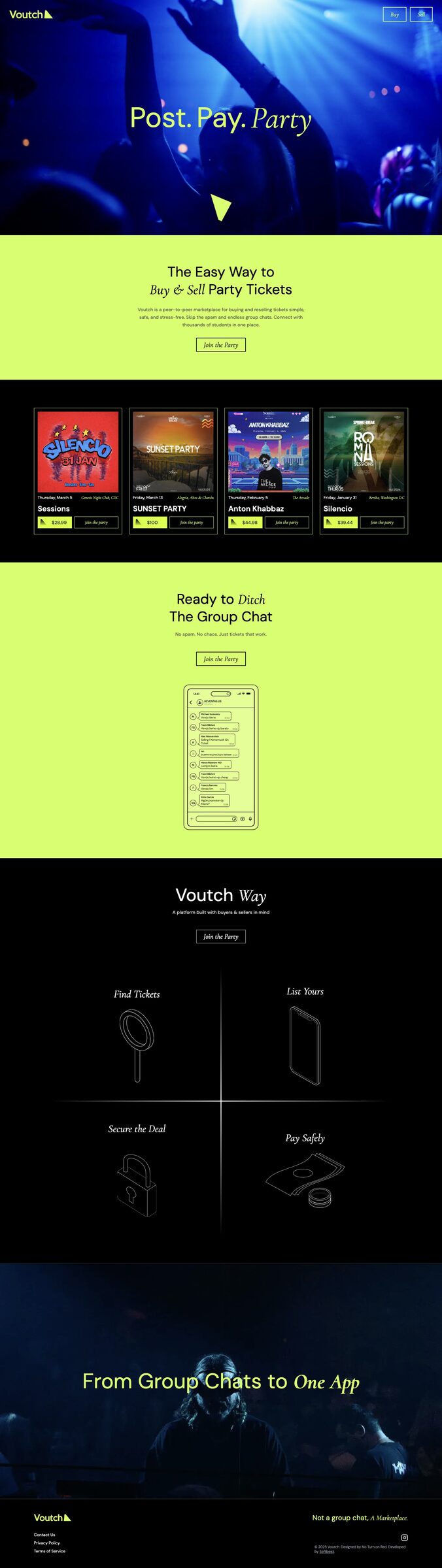
The site is a bespoke ticket-flow architecture — designed and built, not dropped onto a marketplace template. 25+ screens carry a seller from listing through to a buyer's cart, checkout, and confirmation, across desktop and mobile, in the same neon system as the brand.
The build
A bespoke ticket-flow architecture — not a template