Turning a stop sign into a studio that always says go
The brand identity for No Turn on Red — a full-service creative studio working across branding, web, app, UI/UX, and motion.
ClientNo Turn on Red (self-founded)
IndustryCreative studio
ServiceBrand identity + art direction
TeamJessica Jiang + Kaiwen Chen
TimelineA few weeks
3
Signal colors
Red, green, yellow — borrowed from the street.
17
Disciplines covered
Branding through projection mapping.
8
Brand mantras
turn on green · future · creativity…
Goal
We co-founded No Turn on Red — a full-service creative studio — and built its brand. The name plays on NYC's "No Turn on Red" rule, a sign that says stop. Our goal was an identity that inverts it: a studio that always moves — turn on green, turn on future, turn on creativity — across every medium from branding to projection mapping.
Challenge
The studio covers an unusually wide range — branding, UI/UX, 3D, installation, projection mapping, sound. The challenge was one identity elastic enough to hold all of it without going generic: a system built on a single clear idea — the broken traffic rule — that still flexes across 17 disciplines and three signal states.
Outcome
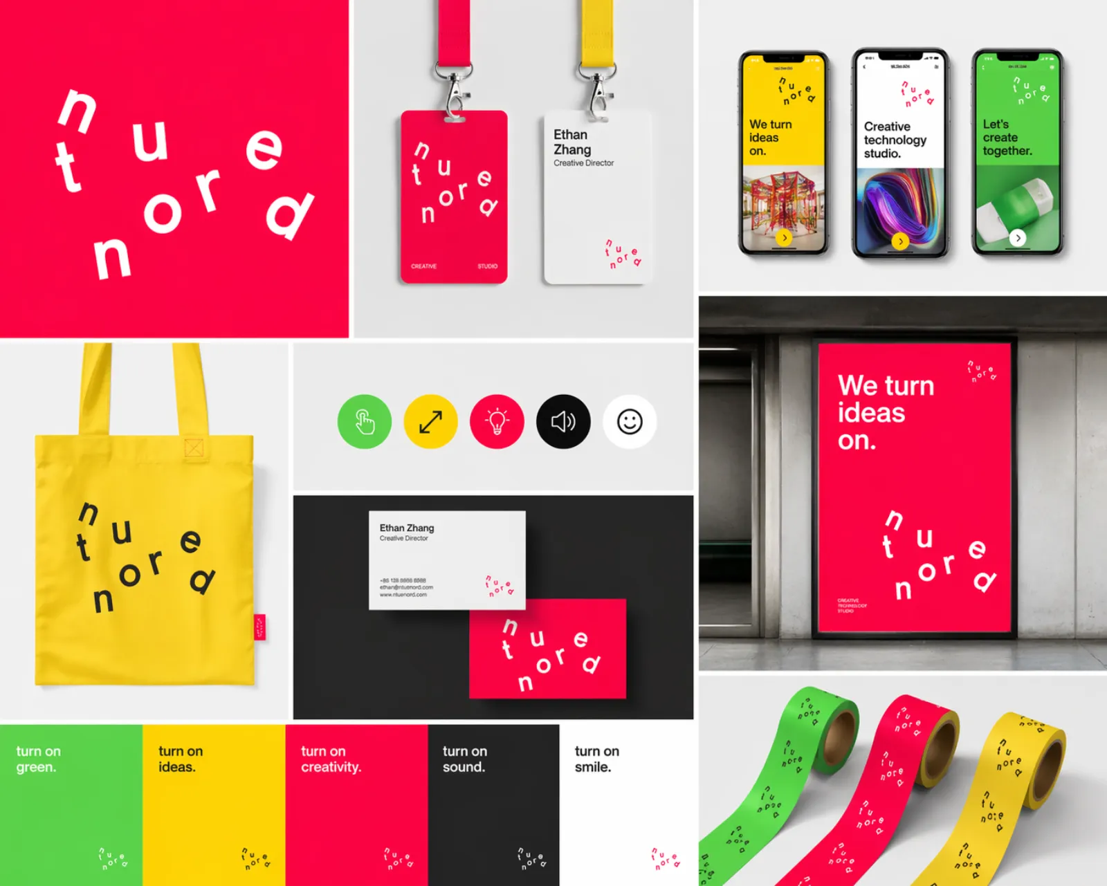
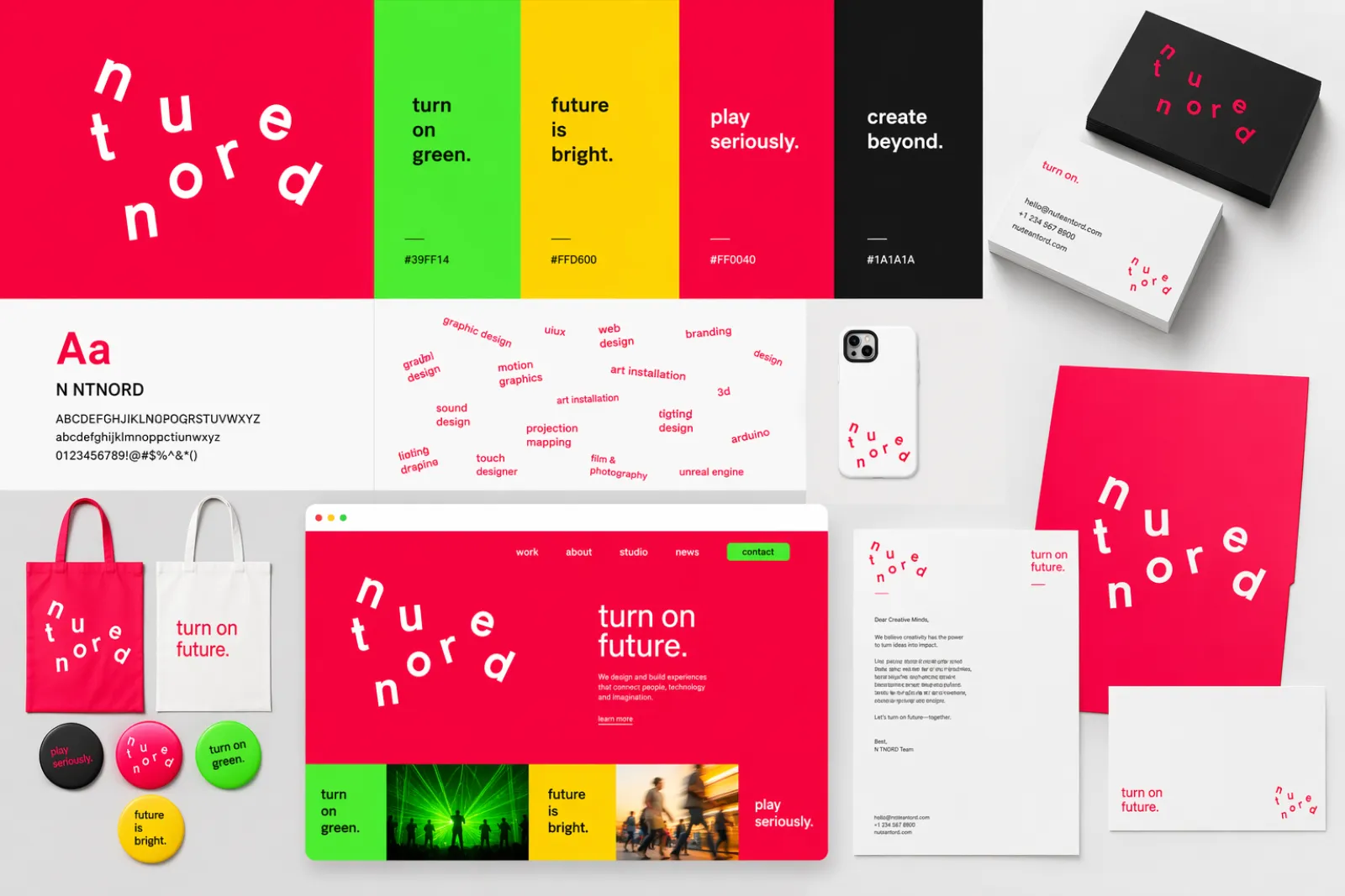
We delivered a signal-language identity drawn straight from the street: a rotated "ntor" wordmark, the three signal colors, a capabilities wheel shown in red / yellow / green states, and a brand-in-use system. One rule, broken on purpose, across everything the studio makes.
01
Identity
The name is a red sign, the studio is the green light
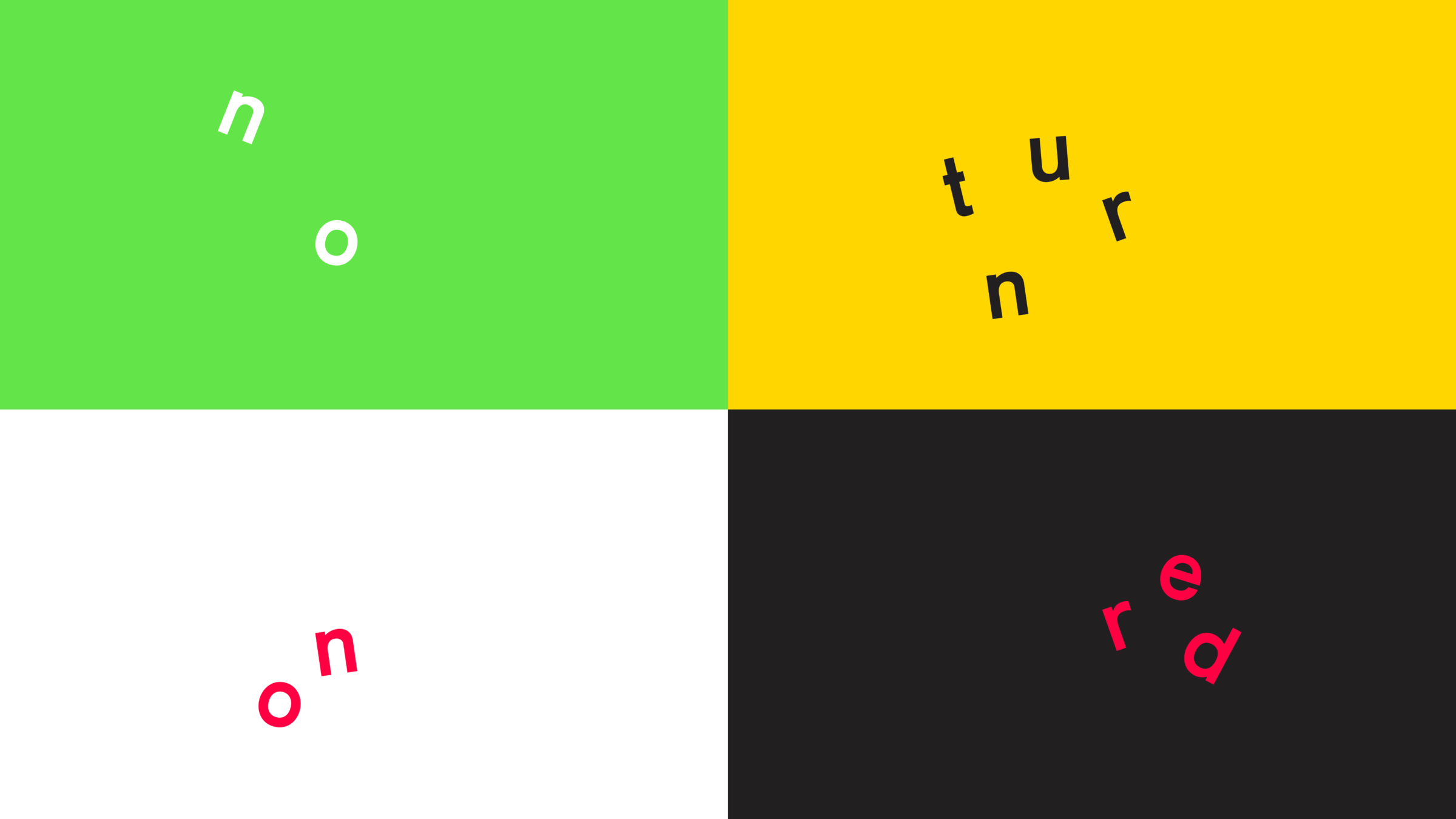
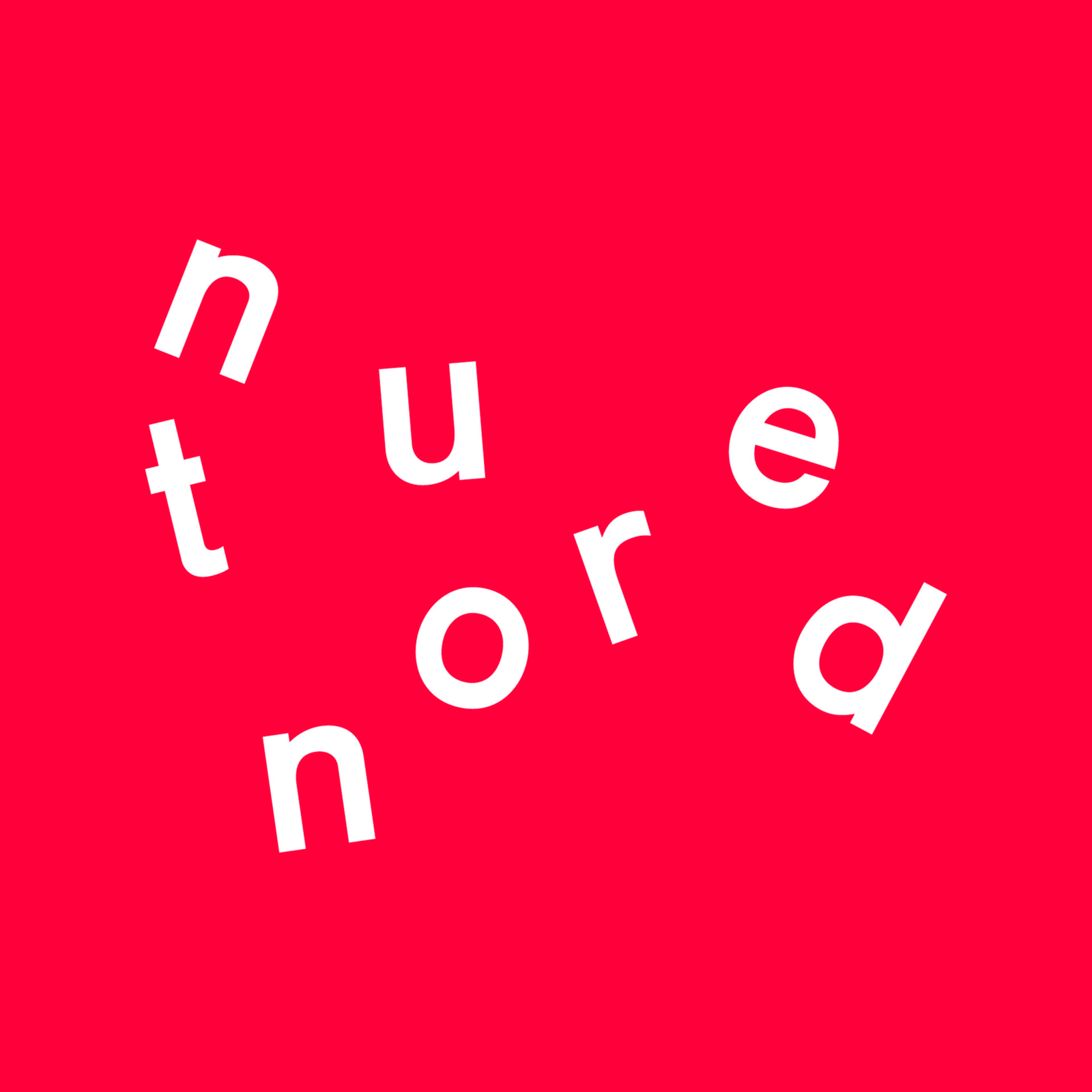
Every mark breaks the rule on purpose — tilted letters, off-kilter baselines, signal colors borrowed straight from the street. The wordmark scatters "ntor" across three rows so you read it the way you obey a street sign: only if you look twice.
The signal language
A rotated "ntor" wordmark across three rows
Signal red / green / yellow, taken from the street
Tilted letters on off-kilter baselines
Neue Haas Grotesk · Söhne · Space Mono
no / turn / on / red — four-panel signal
NTOR mark on signal redNTOR wide lockup
02
Capabilities
One studio, every medium
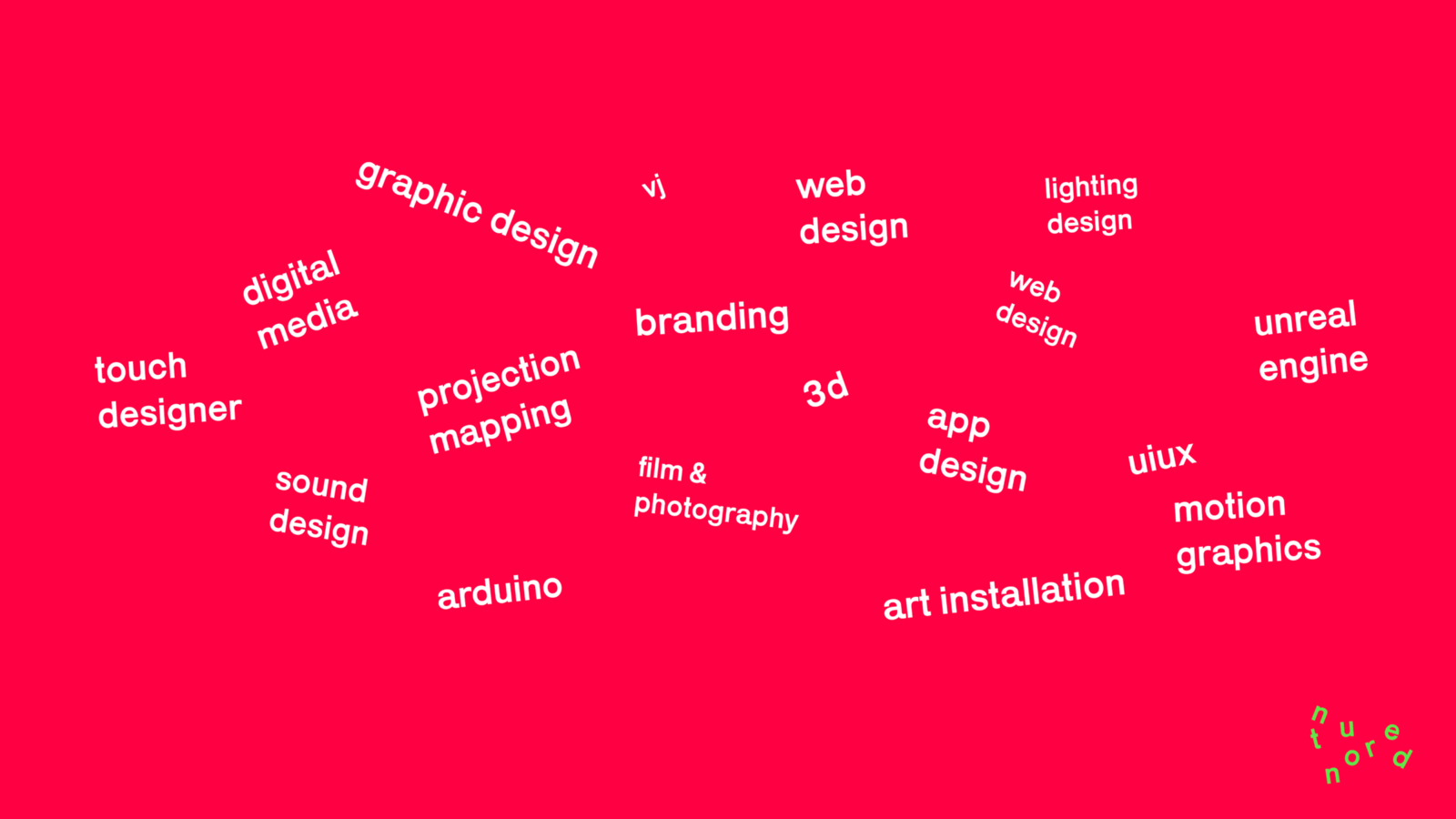
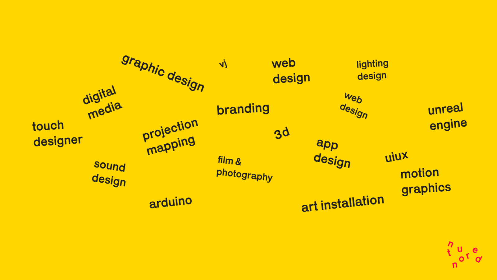
The full-service range is shown as a capabilities wheel that switches between signal states — the same coverage on signal red and signal yellow. It says, plainly, that this studio does the thing you came for and the fifteen things you didn't know you needed.
What the studio does
Brand · Graphic · UI/UX · Web · App
Motion · Film & Photography · 3D · Unreal Engine
TouchDesigner · Projection mapping · Art installation
Lighting · Sound · VJ · Digital media · Arduino
Capabilities wheel — signal redCapabilities wheel — signal yellow
03
Brand in use
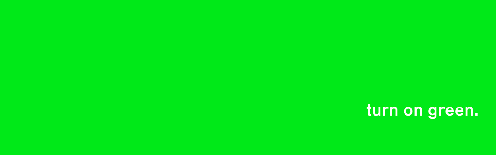
Turn on green
The system lands across a green banner and a wall of applications — the rule, broken on purpose, in the wild. The mantras carry the voice from the wordmark out onto everything the studio touches.
The mantras
turn on green · turn on future · turn on creativity
turn on sound · turn on smile
play seriously · create beyond
future is bright
"turn on green." banner
Palette
#FB0A2A
Signal Red
Primary · the rule
#04E337
Signal Green
Go · CTA · the dare
#FFCE00
Signal Yellow
Pause · caution · the hinge
#1A1A1A
Pavement
Type · asphalt contrast
#FFFFFF
Paint
Surface · crosswalk stripe
Typography
Neue Haas Grotesk
Logomark · Display
Geometric sans, rotated letter-by-letter — letters sit on their own axis like cars at a light.
Söhne
Body · UI
Neutral, dependable — the voice-over of a public-service announcement about creative work.
Space Mono
Meta · Caption
Fixed-width utility — timestamps, services, and the small print you read at intersections.