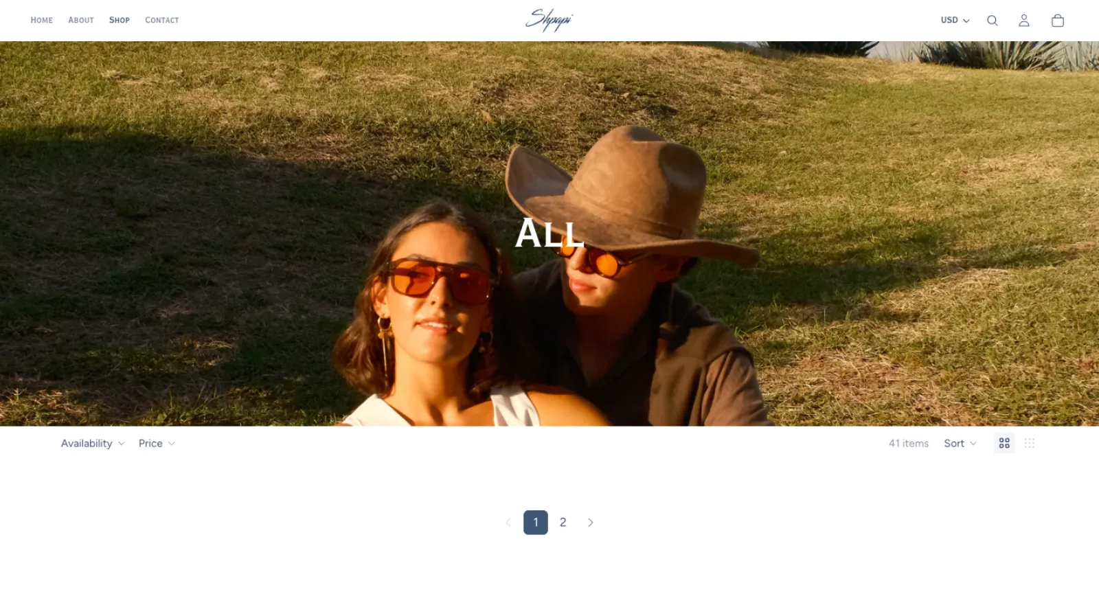
We redesigned the Shpapi Vision storefront to grow with the brand. Since launch, prices had roughly doubled, the range had moved into daytime styles, and the audience had outgrown the founders' circle. Our goal was to keep the script logo and founder voice while rebuilding everything around them into a store that sells the product, not just the mood.
Challenge
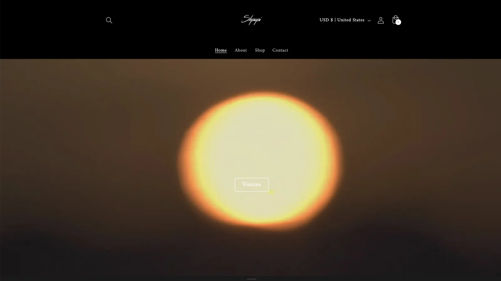
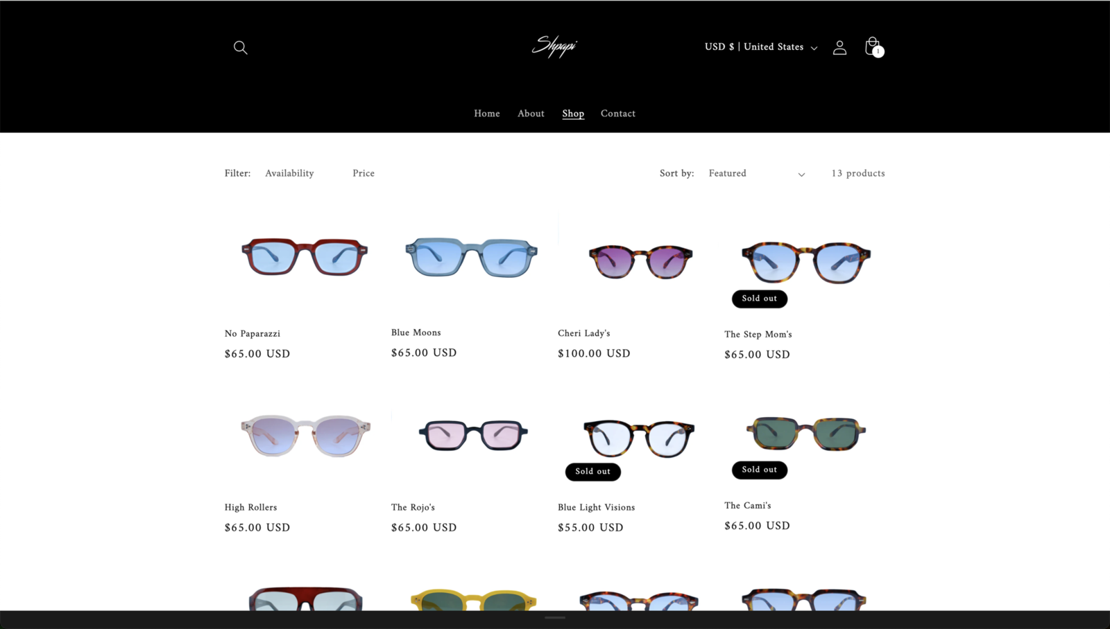
The original site sold at night — a black background, a white serif, a sun on the homepage, and four $65 frames stacked against a club backdrop. The catch was that this mood was also the brand's equity. We had to move the experience into warm, product-first daylight — lighter, not softer — without alienating the people who fell for the club-night version.
Outcome
We delivered a fully customized Shopify storefront with a repositioned brand voice and a new visual system: editorial daylight in place of club-night neon, a rebuilt type and color system, and product-led merchandising that moves people toward checkout. The site is live at shpapivision.com.
01
Website audit
Where the old site got in the way
We started by auditing the live site against how far the brand had come. The homepage opened on atmosphere — a sun, a dark room, a club mood — and pushed the product several scrolls down; navigation assumed an insider who already knew the range, and product detail was thin.
What we audited
Homepage hierarchy & the first scroll
Navigation & product discovery
Product-detail depth and pricing
The path from browse to cart
What we found
The product sat below the mood, several scrolls down
Navigation assumed an insider who knew the range
Thin product detail, little pricing context
No obvious route to checkout
Before — the club-night homepageBefore — the shop, product pushed down
02
The redesign
Editorial daylight, product first
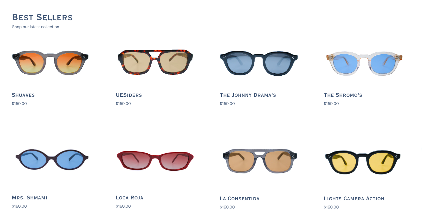
We kept the script wordmark and the founders' voice and changed everything around them. The black-room palette gave way to warm cream, sky, and navy; the type system was rebuilt around Cormorant and Instrument Serif for editorial headers, with Figtree carrying the UI; and every page was reordered to lead with the product.
What changed
Warm cream / sky / navy in place of the black room
Type rebuilt: Cormorant + Instrument Serif for headers, Figtree for UI
Every page reordered to lead with the product
Daylight product photography over night-out atmosphere
The new system at a glance
After — hero, product within the first scrollAfter — product-led merchandising
03
Outcome
A storefront that sells
The result is a warm, editorial storefront on a fully customized Shopify theme — product-first merchandising, a clearer path to checkout, and a brand system that scales as the range moves beyond eyewear into travel and everyday pieces.
What shipped
A fully customized Shopify theme
Product-first homepage & collection pages
A clearer cart → checkout path
A brand system that scales beyond eyewear
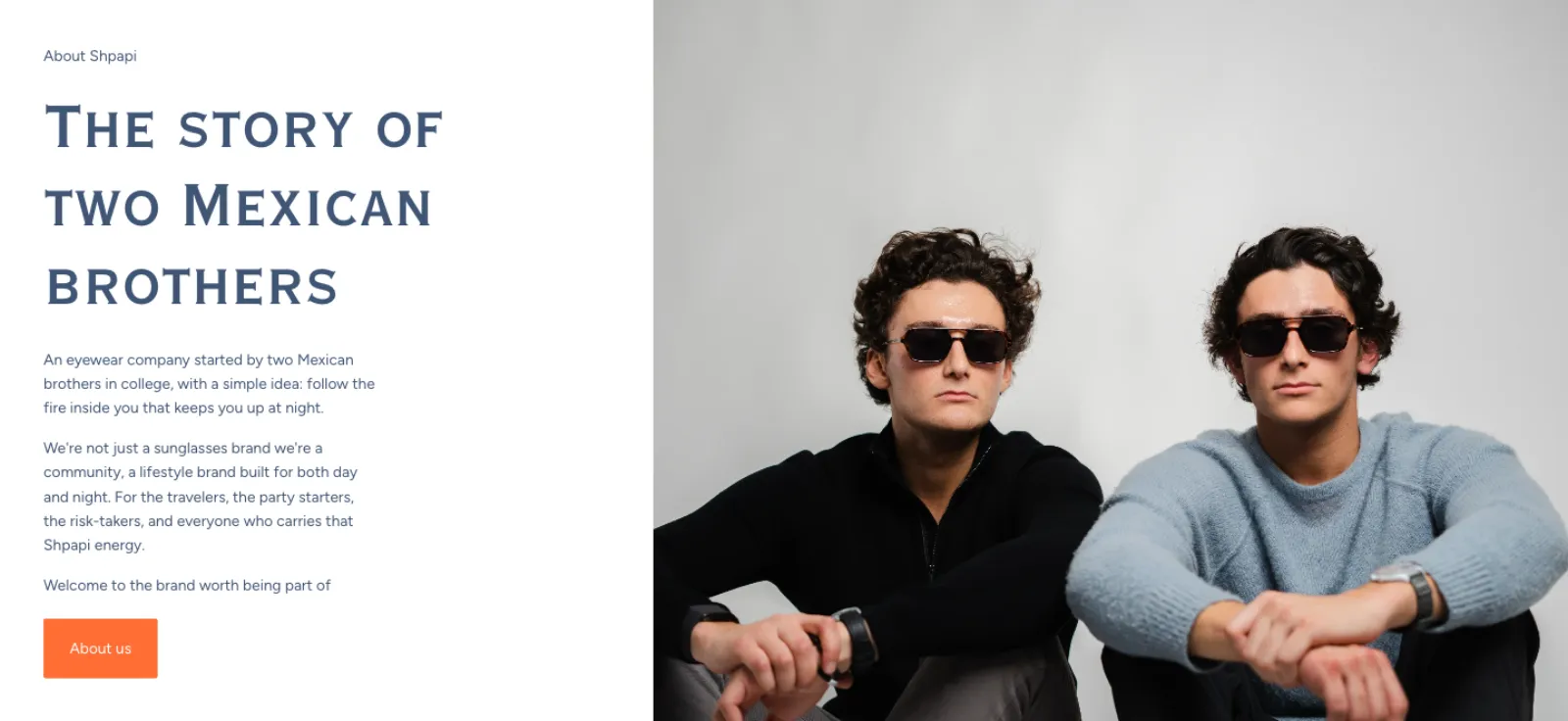
After — the brothers' story, in daylightAfter — the shop, built to convert
Palette
#000000
Black
Primary surface
#B0CCEC
Sky Blue
Day · light accent
#3D5077
Vision Navy
Type · headers · depth
#FBF5EB
Cream
Surface · warm light
#84614C
Camel
Secondary · sun-warmed
Typography
Cormorant
Display · centered serif
Editorial display serif that carries the headlines and the brand's softer daylight voice.
Instrument Serif
Display · small-caps
Tight small-caps display for section headers — structure without shouting.
Figtree
Body · UI · nav
Neutral sans for UI, navigation, and product copy — keeps the store functional.
Brand repositioningType + color system rebuildFully customized Shopify storefrontProduct merchandising + checkout flow