Building two patient-facing brands on one scientific spine
A biotech parent brand (innaRx) and its respiratory-therapeutics sub-brand (Inspire Rx) — two identities that share a scientific logic but speak to their own patient worlds.
We built the brand for innaRx — a biotech developing best-in-class oral modulators in innate immunity — and for Inspire Rx, its respiratory-therapeutics sub-brand. The goal was two identities that share one scientific spine but each speak to their own patient world, plus a live marketing site to launch them.
Challenge
The two brands had to feel related without looking the same: innaRx is the corporate, science-forward parent; Inspire Rx is warmer and patient-facing. The challenge was a shared visual logic — mark, gradient, type — that could flex from a navy, clinical register into a warmer teal one without splitting into two unrelated brands.
Outcome
We delivered two complete identity systems on one scientific spine — logo, color, gradient, and type for each — and shipped the live innarx.com marketing site presenting the pipeline and both brands together.
01
innaRx
The parent brand — innate immunity
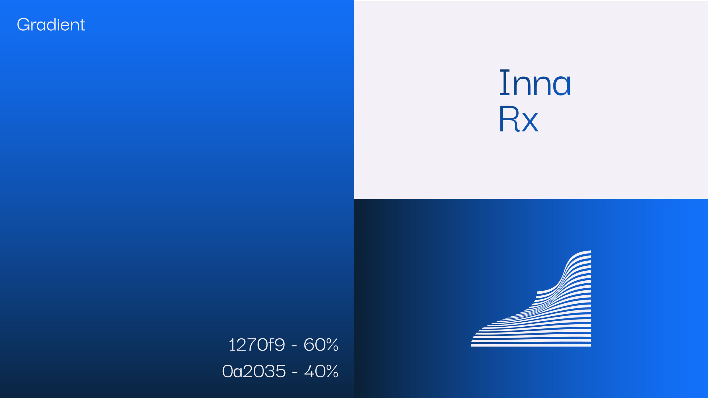
The parent mark reads as a web absorbing and capturing — the way the innate immune system blocks a pathogen at the primary barrier. A stratified gradient of lines builds vitality and flow from a hard navy baseline, then softens toward light. The register is corporate and science-forward.
The system
Mark: a capturing web, drawn from innate immunity
Navy → light stratified gradient
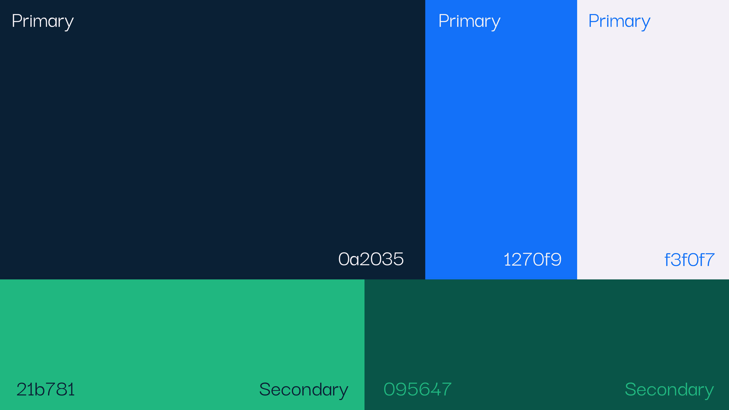
Palette: Deep Navy · Inna Blue · Vital Green
Type: Darker Grotesque across the hierarchy
innaRx logoinnaRx color system
innaRx gradient
02
Inspire Rx
The sub-brand — breath, as treatment
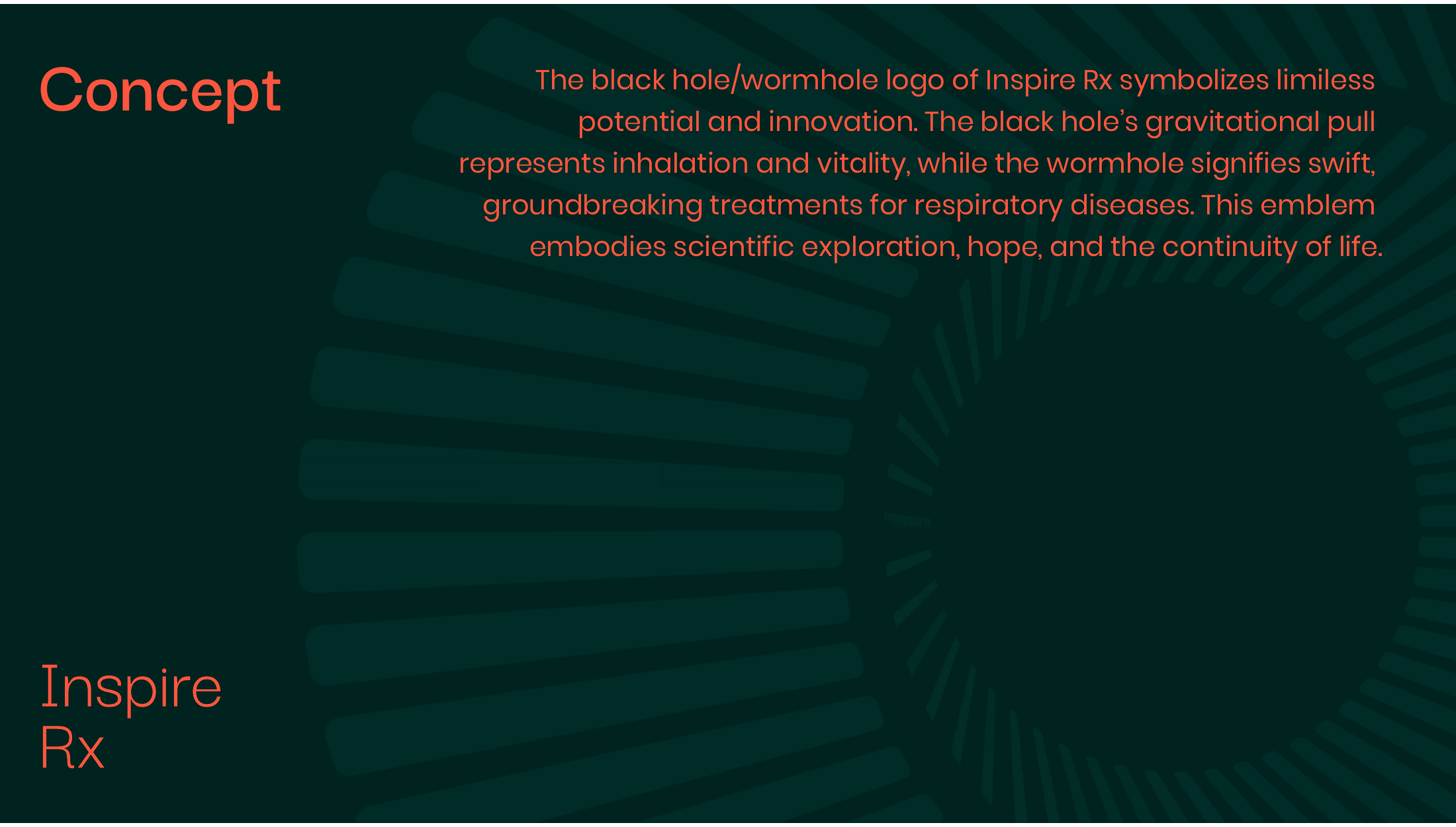
The sub-brand mark is a black-hole / wormhole: the gravitational pull stands for inhalation and vitality, the wormhole for swift, groundbreaking respiratory treatments. Teal ties Inspire Rx to innaRx without repeating it — warmer and more patient-facing, with a coral accent for heat.
The system
Mark: a wormhole — inhalation and breakthrough
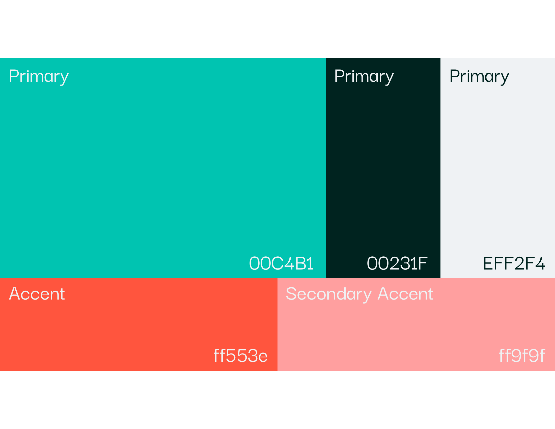
Palette: Inspire Teal · Deep Forest · Pulse Coral
Type: Poppins for content, Darker Grotesque for the wordmark
Warmer, patient-facing register
Inspire Rx logoInspire Rx color system
Inspire Rx concept
03
Website
Launching the pipeline
We designed and built the live innarx.com marketing site, presenting the parent pipeline and both brands together — the first public home for the science.
The launch
The first public home for the science
Parent pipeline and both brands, on one stage
Designed and built — live at innarx.com
Live — innarx.com
Brand strategy — parent + sub-brandLogo + mark for each brandColor, gradient + type systemsLive innarx.com marketing site